VARIOUS GALLERY OPTIONS
test version
VARIOUS GALLERY OPTIONS
test version
First a quick test of a typography plugin I added. It should hyphenate words > 9 characters when necessary.
I thought it might also make chemical formulae look nice, such as CO2 or H2O, but I guess not.
What about math superscripts such as 3^n or n^3 or 2^3 or 3^2?
Does it do square-feet ft2 or 13 m2 or 13m2 or 123 m3?
It might also resolve some issues—like spaces around dashes-dots-dashes.
Below is a collection of photo galleries with different options. Take a look, keeping in mind some of the issue that have been raised:
- viewing on computer vs. mobile device
- does it become clear that there are multiple photos soon enough? a) if you’re actually reading the text; b) if you’re scrolling through just looking at the pictures?
- Is the auto-changing a distraction?
- Are the captions adequately accessible?
- Is it clear when you can (or can’t) make the pix go big?

current “best”
This gallery example incorporates what seem to be the best combination of options suggested so far that I can achieve with the web-building software I’m using.
When the cursor is NOT hovering over the gallery:
- photo changes automatically every 6 seconds
- Navigation dots are visible below the photo, clicking on one selects a photo
- Navigation arrows are visible on the photo
When cursor hovers over the gallery:
- cursor changes to a hand
- auto-changing stops
- caption appears near the cursor (after a brief delay)
- the navigation arrows move slightly inward, and clicking on them changes the photo
- clicking elsewhere in the photo makes the gallery go full-size.
When picture is full-size:
- the navigation dots disappear
- the navigation arrows go to the edges of the screen
- captions appear below the photo
- cursor is a hand if over the photo, and clicking changes to next photo
- cursor is minus sign (-) if outside photo, and clicking changes to small version
- cursor is a hand if over the navigation arrows, and clicking goes to previous or next photo, depending on arrow direction
On a mobile device, these features are similar, except that there is no cursor, and the navigation arrows are always present.
Problems:
When someone new sees this, they need to figure out the these interactive features. But I think that making the arrows and dots more conspicuous probably makes it more obvious that this isn’t just one photo..
It’s also not obvious that clicking on the gallery will cause it to go full-screen, except that the cursor turning into a hand is a clue.
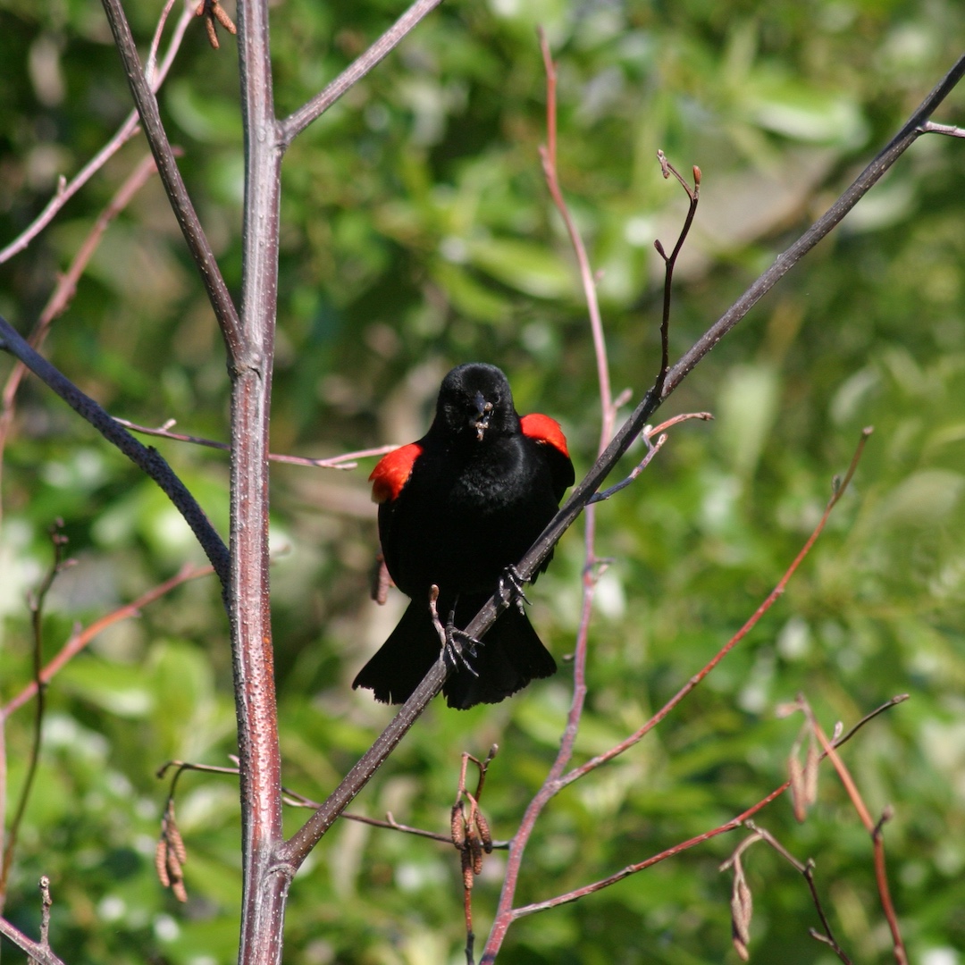
Red-winged blackbird
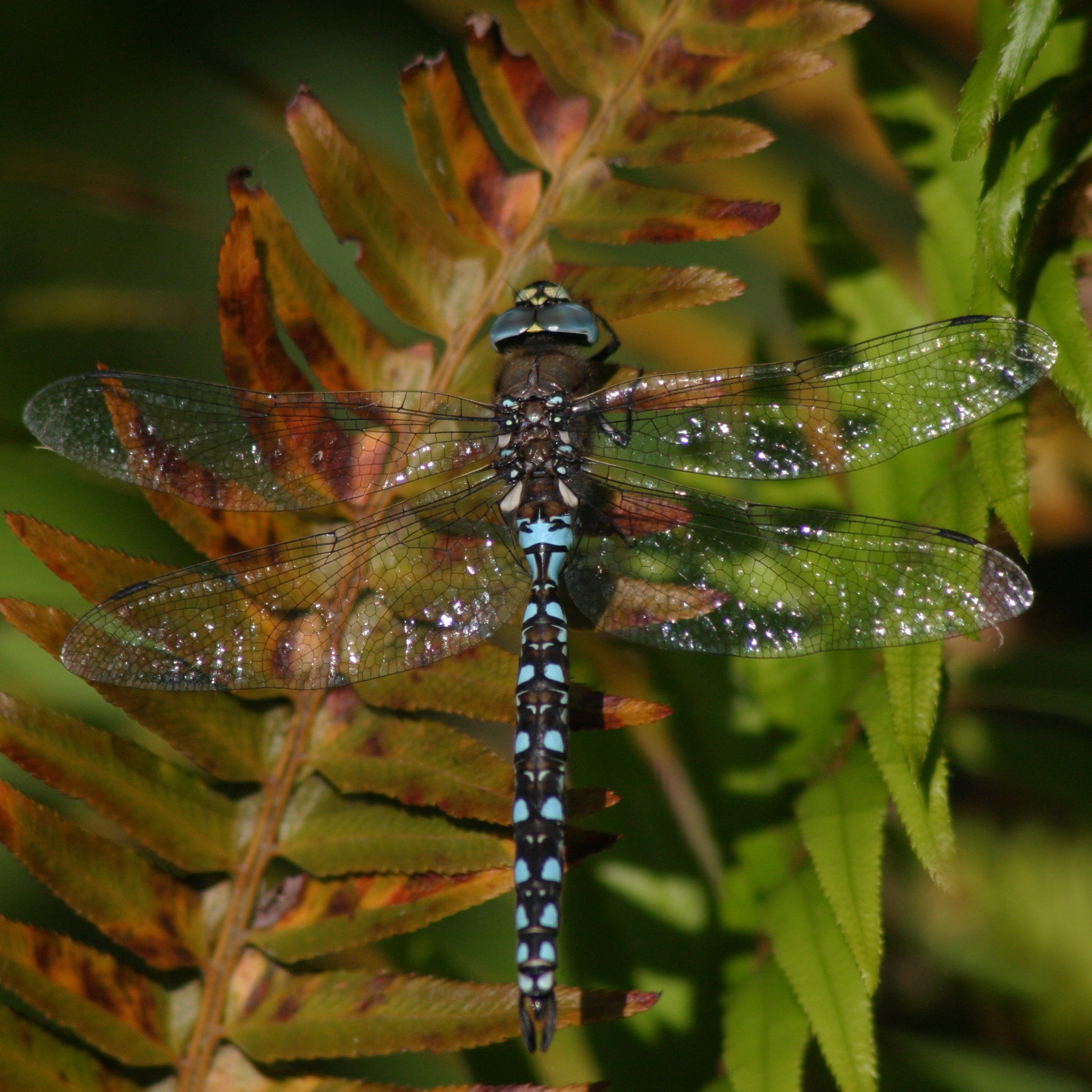
Pond-Dragon
Woodduck hen
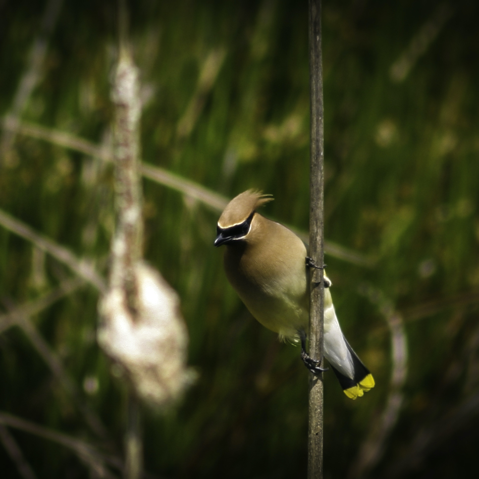
Cedar waxwing
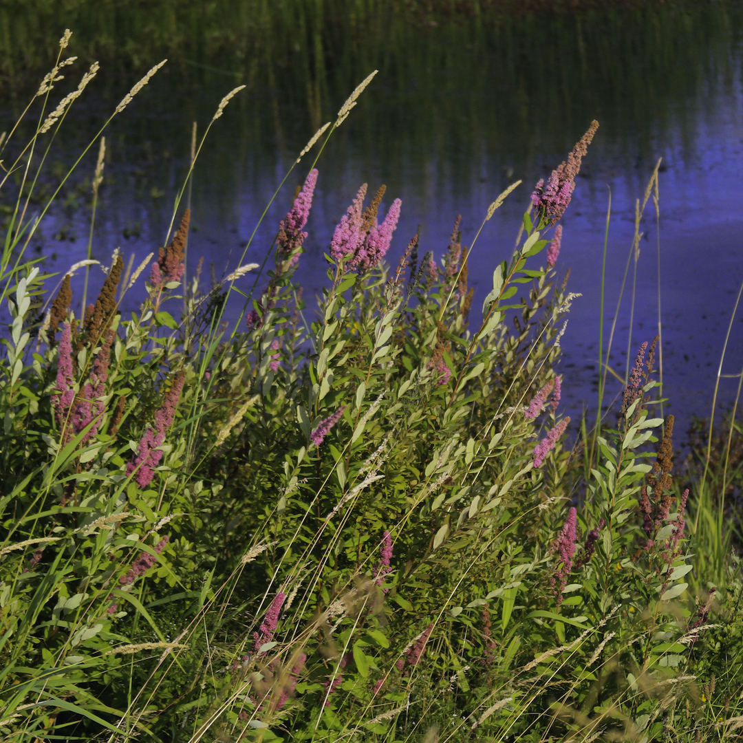
Edge of a spirea wetland
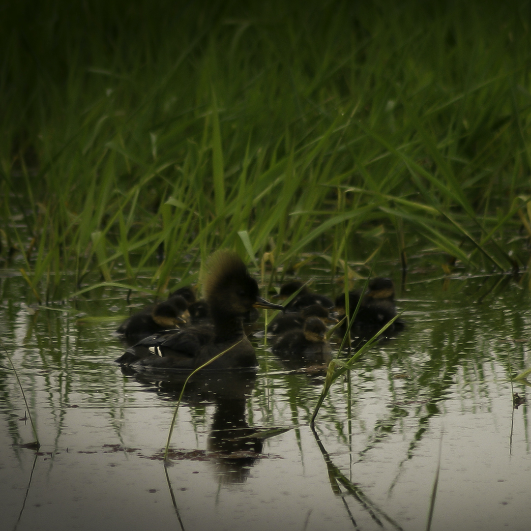
Merganser mom
a very different approach
Below is another approach to a photo gallery. It pretty much solves the problems above, as its functionality is more obvious. The choice for me depends on the intended initial visual impact. I find this one more useful when the variety of photos is really a key part of understanding the text. I don’t use it unless the individual photos are so simple that the small thumbnails can show something. In this example, these photos and the captions might be intriguing enough to get the reader to click on them.
What do you think?
One more option below…
a different gallery module
This version solves the caption problem. And I think I can make its arrows always be there. But it will not go full-screen, which for me is a deal-killer.
Gallery Module Tests
Problem: spacing of the thumbnails is for 4 images regardless of how many I add.
How can I make the gallery fill the width with equal-spaced images even if there are only 2 or 3?
For example, here are galleries with 2, 3, and 4 images:

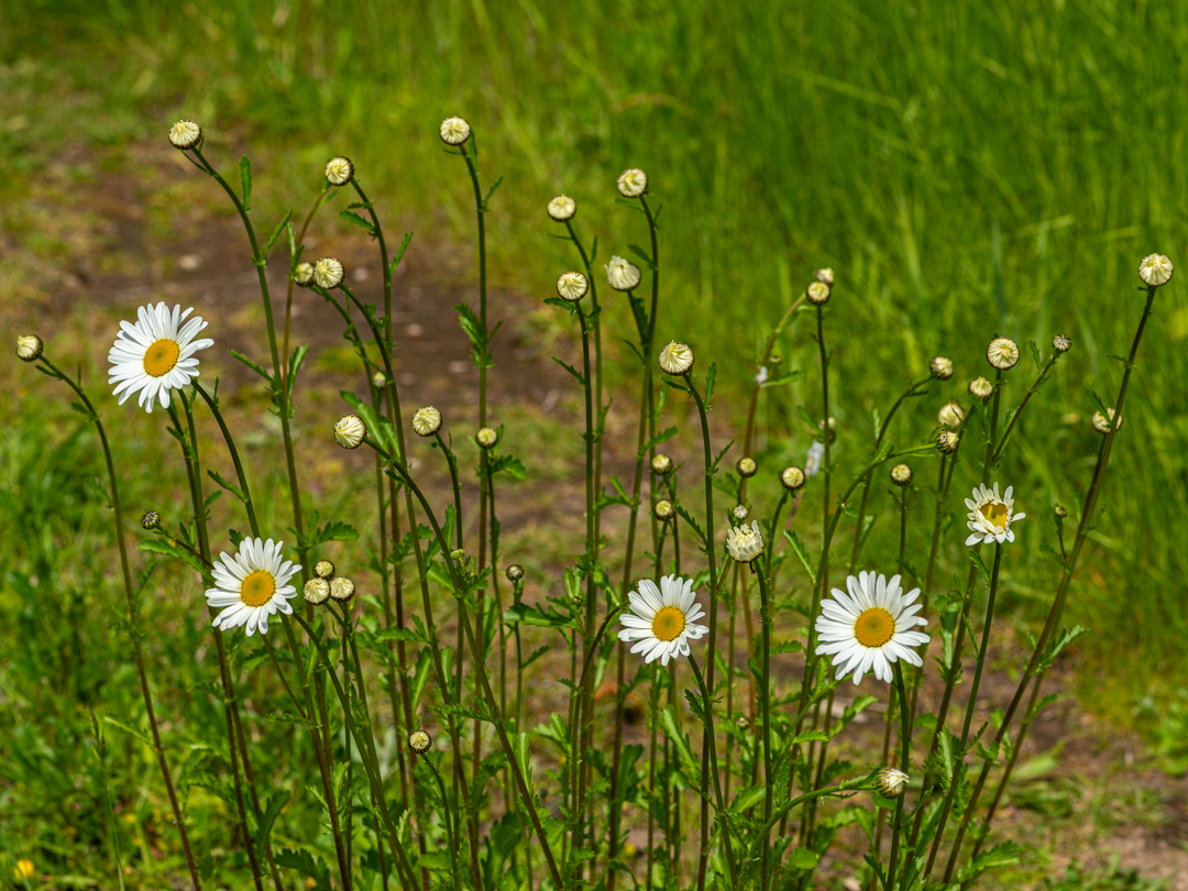
Ground nesting bee
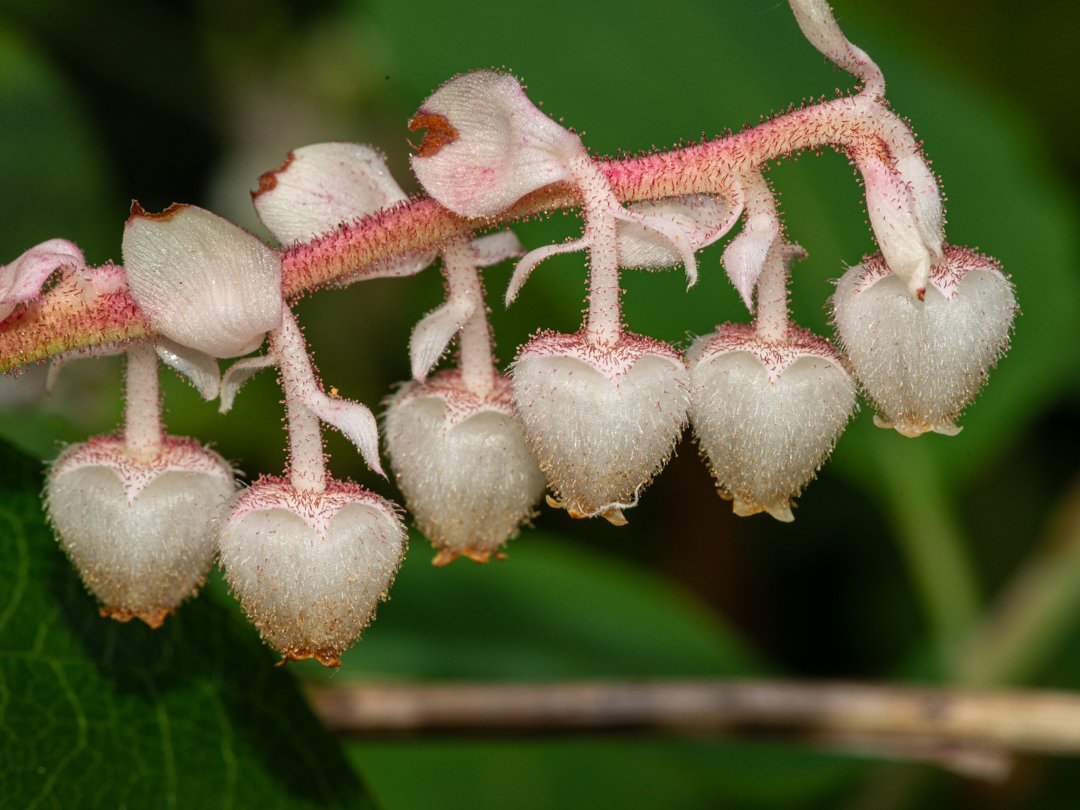
Salal flowers
20250523-8007558D800
Ground nesting bee
Salal flowers
20250523-8007558D800
Ground nesting bee
Salal flowers
20250523-8007558D800
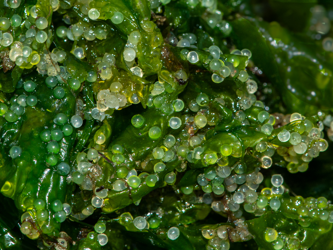
Herring eggs on kelp
In the case of 2 or 3 images, I would like those gallery thumbnails to be equally spaced across the screen like this, yet still have all the features of a gallery: